

If you want an aesthetic that feels intellectual, nostalgic, and effortlessly refined, the dark academia color palette is your foundation. These colors aren’t random. They’re inspired by old libraries, worn leather chairs, vintage literature, and the quiet mood of academic life. The palette mixes deep greens, browns, burgundy, navy, and muted neutrals, giving you a blend that works for everything from room styling to digital design.
This aesthetic isn’t only about looking vintage. It’s about creating a mood that feels grounded, thoughtful, and expressive. The palette supports rich textures, classic patterns, and preppy influences without losing its signature depth. Whether you’re building visuals for a project, designing a room, or refining your personal style, understanding these color combinations helps you create something that feels intentional instead of chaotic.
In this guide, you’ll get a full breakdown of core colors, modern variations, hex codes, and practical ways to apply them. You’ll also find inspiration palettes, preppy-compatible tones, and step-by-step tips to build your own version of the look.
1. The Color Palette: A Deeper Dive
This palette works because it relies on depth, contrast, and muted elegance. These colors echo old-world academia places filled with classical architecture, handwritten notes, and vintage décor. Instead of using bright, trendy shades, this palette leans into tones that feel stable, intellectual, and timeless.
Below are the four core combinations that bring this aesthetic to life:
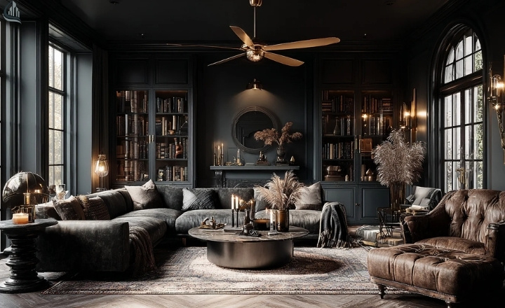
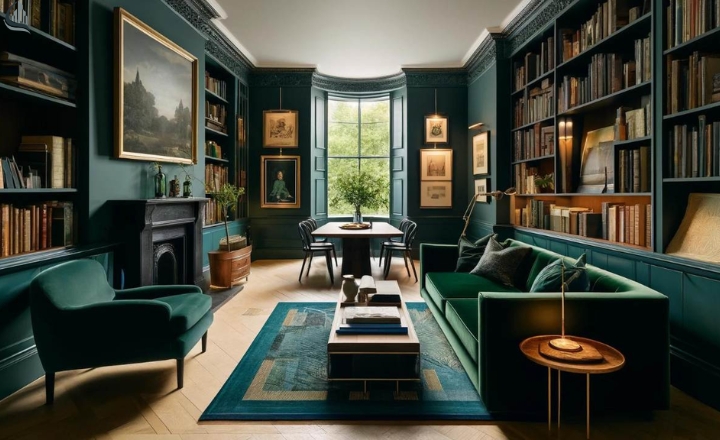
Classic Library: Dark Greens, Navy Blue, Ivory
This combination is the backbone of the aesthetic. Dark green captures the mood of vintage libraries and botanical illustrations. Navy adds a clean scholarly balance, and ivory softens everything without brightening the palette too much. Together, these shades create a calm, grounded look that feels instantly academic.
Use these colors :
• Room styling with old-book vibes
• Website layouts that need depth
• Outfits inspired by classic preppy elements
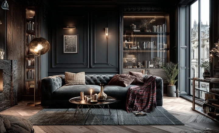
Sophisticated Study: Burgundy, Gold, Black
Burgundy gives you mood and richness. Gold adds refinement without overwhelming the darker tones. Black keeps everything sharp, structured, and formal. The mix feels mature and bold—perfect for design work that needs intensity.
Use this palette for:
• Posters, digital art, and mood boards
• Statement corners in interior design
• Dramatic accents in fashion styling
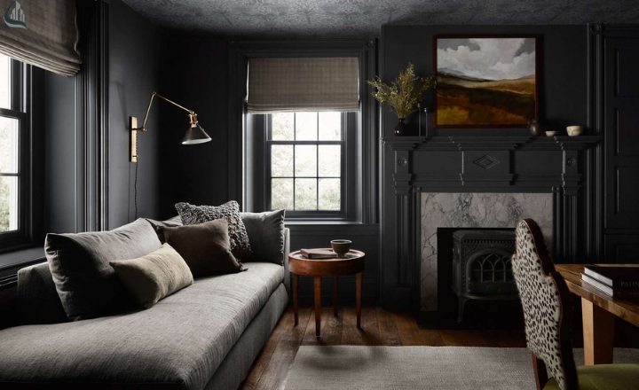
Cozy Reading Nook: Brown, Cream, White
This palette focuses on warmth and subtle contrast.
Brown reflects leather, wood, and aged paper. Cream softens the palette, making it approachable. White keeps the look clean but not modern-minimalist. This combination is comforting and nostalgic, ideal for designs that need a softer touch.
Use it for:
• Bedroom or study spaces
• Social media graphics with a warm tone
• Casual preppy-inspired outfits
Mysterious Travel: Dark Greens, Brown, Brass
This combination reflects worn maps, vintage suitcases, and historical exploration.
Dark green brings depth, brown adds an earthy foundation, and brass introduces a muted metallic accent. The result feels slightly adventurous while still fitting perfectly within the Dark Academia environment.
Use this trio for:
• Travel-themed visuals
• Antique-inspired product designs
• Accent details in décor or branding
2. Dark Academia Color Palette Inspiration
Finding inspiration for the Dark Academia colour palette is easier when you look at its roots and classic literature, vintage fashion, and old academic environments. The aesthetic blends intellectual charm with muted tones, giving you a style that feels timeless instead of trendy. You can pull ideas from textures, materials, and even traditional preppy aesthetic elements to build a balanced look.
Here’s a tightened, cleaner, more concise version—same tone, still human, still SEO-friendly:
Old Libraries and Vintage Books
Leather covers, deep greens, and worn textures give you natural examples of earthy, academic shades.
Preppy Fashion and Classic Patterns
Muted preppy patterns pair well with darker tones. If you’re unsure what preppy colors are, think navy, cream, burgundy, and forest green.
Autumn Landscapes
Mossy greens, browns, and soft neutrals from fall scenery naturally match the mood of this palette.
Art Museums and Classical Architecture
Stone, charcoal, and ivory provide an elegant contrast for a slightly refined, modern interpretation.
Preppy Core Influence
The polished look of preppy core blends structure with moody tones, making the palette more flexible for interiors, fashion, or digital design.
3. Modern Color Palettes
Aged paper, deep green book covers, and worn leather bindings naturally reflect the tones in dark academic style. These spaces often mix greens, browns, and navy. They give you the perfect reference for earthy combinations and shadowy contrasts.
Vibrant Additions
You can add subtle hints of plum, muted teal, or soft terracotta. These additions keep the palette grounded while giving it a more current look. Shades inspired by the dark academia green or dark academia purple bring depth without overpowering the muted base.
Minimalism in Modern Dark Academia
Minimalist designs favour fewer colors and more negative space. Here, soft ivory, charcoal, warm brown, and deep navy create a calm, focused atmosphere. Pairing minimalism with the colour palette approach helps the aesthetic feel intentional rather than heavy.
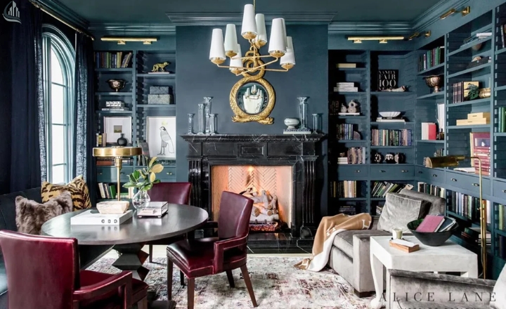
Read about Paint ideas for the living room.
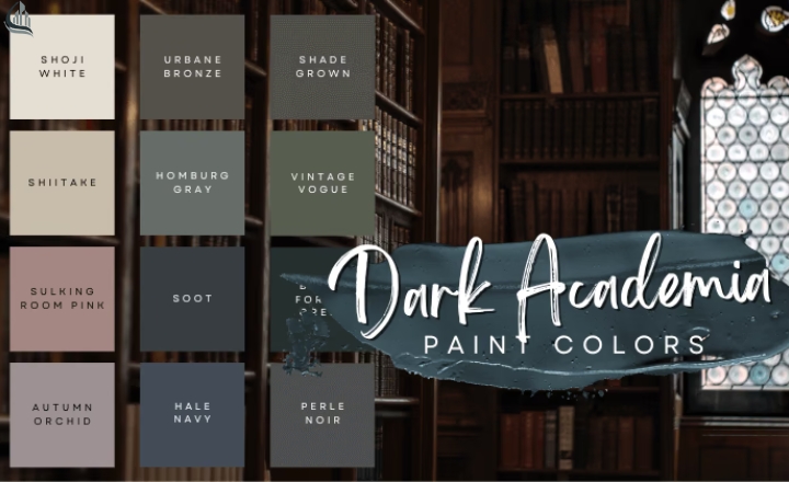
4. Dark Academia Color Palette Hex Codes and Applications
Dark academia color palette hex codes help translate the aesthetic into practical use for design, branding, and interiors. Deep greens, muted burgundy tones, soft ivory, and worn browns have recognizable hex ranges that bring consistency to digital and print projects. Using these codes ensures your palette looks uniform, whether you’re creating mood boards, painting a room, or designing social media templates.
Sample Hex Codes
Here are dependable, on-theme shades you can use:
- Deep Green — #1F3A34
- Navy Blue — #1A2A40
- Burgundy — #4A1F2D
- Warm Brown — #5B4231
- Ivory — #F2E9D8
- Charcoal — #3C3C3C
These tones match the mood typically associated with the dark academia green, antique books, study rooms, and vintage libraries.
How to Apply These Shades
Home décor: Use deep greens and browns for accent walls, while ivory creates balance.
Digital design: Navy and charcoal work well for backgrounds, with contrasting cream for text.
Fashion: Burgundy and brown pair naturally with preppy patterns used in the preppy aesthetic.
Perfect, here’s the continuation with natural flow and keywords in bold highlight:
5. Create Your Own Palette
Crafting your personalized Warm Color Scheme allows you to blend classic tones with your own style. Start by selecting a base color, which may often be deep green, navy, or burgundy. Then add complementary shades like warm browns, ivory, or muted golds.
Step 1: Choose Your Base Colors
Base colors set the overall mood. Popular choices include:
- Dark green for a studious, library feel
- Burgundy for warmth and sophistication
- Navy blue for a timeless, versatile foundation
Step 2: Add Accent Colors
Accent colors highlight areas and prevent monotony. Consider:
- Ivory or cream for balance and contrast
- Brass or muted gold for luxury touches
- Subtle shades of brown for grounding the palette
Step 3: Test and Adjust
- Use swatches or digital design tools to visualize the palette
- Adjust the balance between dark and light tones to suit your space or project
- Incorporate one bold color for a statement without overpowering the aesthetic
By following these steps, you can create a Dark Academia colour palette that is uniquely yours, functional, and visually cohesive.
6. Styling Ideas with Your Dark Color Palette
Once you have your Academia Color Palette, it’s time to bring it to life through style. Think layers, textures, and classic patterns that reflect the preppy aesthetic. Pair deep greens, rich burgundy, and muted browns with timeless pieces like tweed blazers, pleated skirts, or wool trousers.
Accessories such as scarves, leather satchels, and vintage-inspired jewelry can accentuate the palette while adding depth and personality. The key is balancing bold tones with neutral shades to create a cohesive, sophisticated look that embodies the Dark Academia aesthetic without feeling overdone. This approach works for both everyday outfits and special occasions, adding an elegant, intellectual edge to your wardrobe.
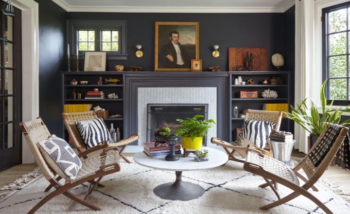
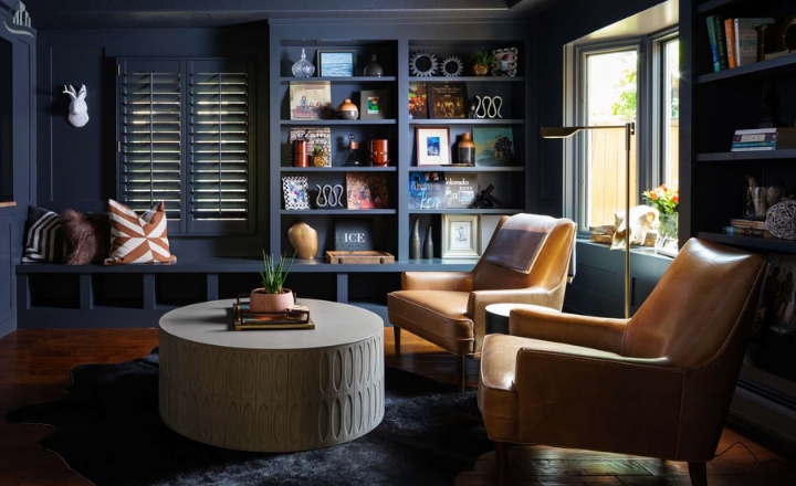
7. How to Use Your Dark Academia Colors Palette in Interiors and Fashion
This isn’t limited to clothing. It can also transform your living spaces. For interiors, incorporate deep wood furniture, antique brass accents, and plush textiles in your chosen colors. Walls, rugs, and curtains in shades of forest green, navy, or burgundy create a cozy, library-like atmosphere.
In fashion, mix dark neutrals with accent colors to craft preppy patterns and layered outfits that are both stylish and thematic. Using this palette thoughtfully allows for harmony between rooms and wardrobe pieces, creating an immersive Dark Academia experience that feels intentional and refined.
You can also read about the two-tone wall ideas.
Conclusion
Dark academia color palette offers a rich blend of deep greens, burgundy, and browns that can transform both your wardrobe and living space. These versatile colors work beautifully together, creating a stylish backdrop that complements a preppy aesthetic.
Don’t be afraid to mix and match accent shades to showcase your personality while maintaining balance and harmony. Whether you’re dressing for class or decorating your cozy reading nook, the Dark Academia aesthetic allows you to express your individuality in creative ways. So go ahead, explore your own combinations and let your imagination flow.
FAQs
What are the colors for Dark Academia?
Dark Academia features deep, moody colors like burgundy, forest green, navy blue, and rich browns. These colors reflect a scholarly and vintage vibe, perfect for cozy, intellectual aesthetics.
What are Gen Z colors?
Gen Z loves bright, vibrant colors like neon green, hot pink, and electric blue. They often mix these bold shades with pastels for a fun, youthful look that stands out.
What is the 60-30-10 rule with 4 colors?
The 60-30-10 rule suggests using 60% of a dominant color, 30% of a secondary color, and 10% as an accent color. For four colors, you simply balance them while still focusing on the main three, ensuring harmony in your design.
Is Dark Academia still in style in 2026?
Yes, Dark Academia continues to be popular in 2026! Its timeless blend of intellectual charm and cozy aesthetics keeps it relevant, making it a favorite among many.
What are the light academia colors?
Light Academia features softer, pastel colors like cream, soft beige, pale pink, and light lavender. These hues create a fresh, airy vibe that feels both relaxed and studious.
What is the 3-3-3 rule for outfits?
The 3-3-3 rule suggests wearing three main pieces, three layers or accessories, and three colors. This helps create a balanced and stylish outfit that feels put-together without being cluttered.
Is Dark Academia LGBTQ+?
Absolutely! Dark Academia is inclusive of all identities, attracting many in the LGBTQ+ community. The aesthetic often celebrates individuality and diversity, making it a welcoming space for everyone.
Can I mix Dark and Light Academia styles?
Definitely! Mixing Dark and Light Academia can create a unique look, blending moody elements with soft, bright touches. Experimenting with styles is a fun way to express your personality!